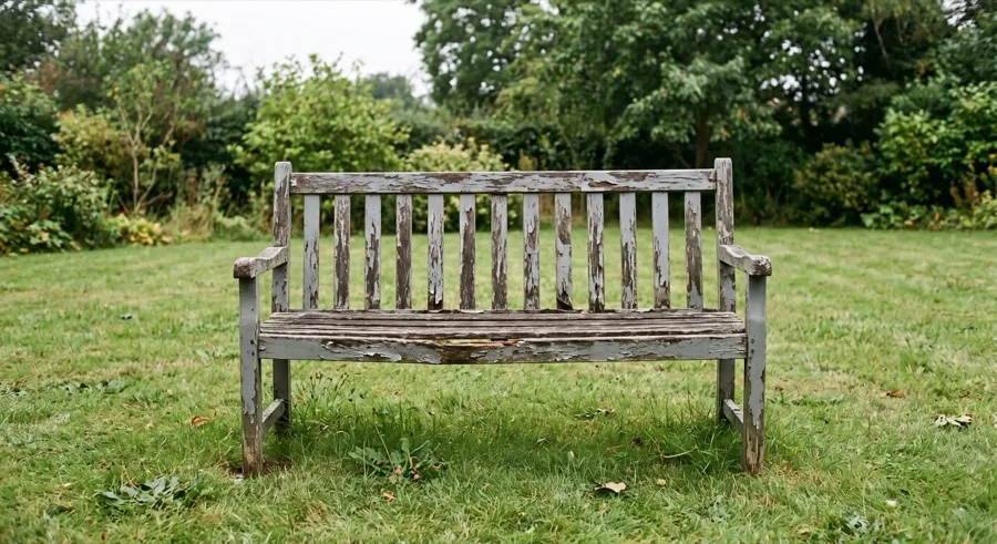
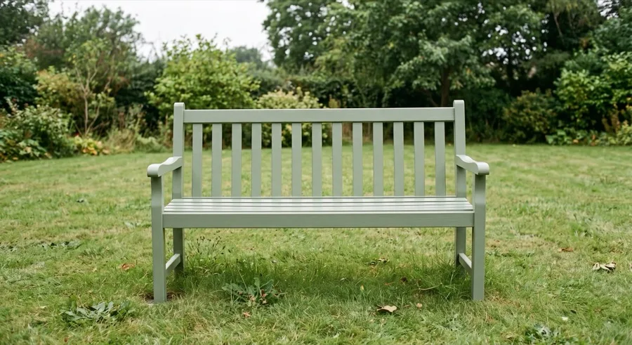
Private browser tool · No signup · No watermark
Merge Photos Side by Side
Two photos, one honest comparison. Built for before-and-after work, with the middle gap and the outer border on separate controls.
- Local processing
- JPG, PNG & WebP
- Works on phone
A side-by-side makes a claim. Make sure it is true.
Putting two photos next to each other is an argument: this changed into that. The viewer reads any visible difference as the result of whatever happened in between — so every difference that came from the camera instead is a small lie, usually an accidental one.
The usual culprits are zoom and distance. Stand closer for the "after" shot and the subject is bigger, which reads as growth or improvement. Shoot the "before" in evening light and the "after" at midday and the second looks cleaner, brighter and better maintained regardless of what you actually did.
Matching the second capture to the first costs almost nothing and makes the comparison hold up: same position, same height, same angle, similar light, same orientation. For renovation and repair work, photographing a fixed reference — a doorframe, a window, a corner — in both frames lets any viewer confirm the scale for themselves.
Equal height is the default here for the same reason: it scales both photos proportionally without cropping, so neither frame is quietly trimmed to make a point.
Two spacing controls, because they do different jobs
Most tools give you one spacing slider that moves everything at once. This page separates them, because the gap between the photos and the padding around the pair mean different things.
Image spacing is the divider. It tells the viewer these are two distinct photographs rather than one wide scene. A thin gap of 8 to 16 pixels is usually enough; too wide and the pair stops reading as a single comparison.
Outer border is the frame. It gives the finished card room to breathe against whatever it is placed on. Set it to zero when the destination already provides padding — a blog post or a slide usually does — and raise it when the image sits directly on a coloured background.
Labels
Labels default to Before and After and can be edited to anything — dates, version names, product names, or turned off entirely for an image-only comparison.
Keep them to one or two words. A label sits on top of the photograph, so a long caption covers exactly the detail the comparison is meant to show. Dates often work better than the generic pair: "March" and "September" carry more information than "Before" and "After" and let the viewer judge the interval.
Check contrast at the label's position specifically. Pale text over a bright sky disappears, and this only becomes obvious once the image is out of the editor.
Before you publish
Cover the labels and look again. If the comparison only works because the words tell you which is which, the images are not carrying it.
Check it at phone size. Two photos side by side means each gets half the width. Detail that is obvious in the editor can vanish in a message thread — and if it does, a vertical stack may serve the comparison better than a row.
Confirm nothing private crept in. Reflections in windows, documents on a desk, screens in the background, house numbers, number plates. Side-by-side images get shared more widely than most, and both frames get scrutinised.